The Impact of Color Theory in Website Design
Website color theory and psychology are crucial aspects of website design that go beyond aesthetics. Colors influence how visitors feel and interact with a site, shaping their perceptions and behaviors. Understanding and applying color can create an appealing website that evokes your audience’s desired emotional responses.
The Science Behind Website Color Theory
Colors have a profound impact on our emotions and decision-making processes. When we see a color, our brains associate it with certain feelings and meanings based on cultural, personal, and universal associations. This can significantly affect how users perceive and interact with a website.
How Colors Influence User Behavior
- Creating Emotional Connections
- Colors have the power to evoke emotions. For instance, blue can create a sense of calm and trust, so tech companies often use it. Green is associated with nature and health, making it a popular choice for organic products and environmentally friendly brands.
- Influencing Perceptions
- The right color choices can enhance a website’s perceived professionalism and credibility. For example, black and grey can give a sleek, modern look, while pastels might convey a softer, more approachable feel.
- Guiding User Actions
- Colors can also guide user actions by highlighting important elements like call-to-action buttons. Bright colors like red and orange can create a sense of urgency, encouraging users to take immediate action. On websites, these bright colors are used for call-to-action buttons, making them stand out from the rest of the website.
The Psychological Impact of Color in Web Design
Colors are pivotal in web design, influencing how visitors feel and behave when interacting with a website. Color’s psychological impact is significant because it can evoke specific emotions, affect perceptions, and guide user actions. Understanding the psychological implications of color choices can help create a website that looks appealing and effectively engages users.
How Colors Affect Emotions
- Red:
- Emotion: Urgency, excitement, passion
- Usage: Red is often used to grab attention and create a sense of urgency. It’s commonly found in clearance sales and call-to-action buttons that need immediate attention.
- Example: A “Buy Now” button in red can encourage quicker decisions and increase conversions.
- Blue:
- Emotion: Trust, calm, security
- Usage: Blue is frequently used by tech companies and financial institutions because it evokes trust and reliability.
- Example: A blue background on a banking website can help users feel more secure when entering personal information.
- Green:
- Emotion: Growth, health, tranquility
- Usage: Green is associated with nature and health, making it ideal for organic products and wellness websites.
- Example: A green color scheme on a health blog can promote feelings of relaxation and well-being.
- Yellow:
- Emotion: Optimism, happiness, energy
- Usage: Yellow can stimulate a sense of positivity and energy but should be used sparingly as it can be overwhelming.
- Example: Highlighting a special offer or new product with yellow can attract attention and convey excitement.
- Purple:
- Emotion: Luxury, creativity, sophistication
- Usage: Purple is often used to denote luxury and high-quality products or to spark creativity.
- Example: A purple accent on a luxury brand’s website can enhance the perception of exclusivity and elegance.
- Orange:
- Emotion: Enthusiasm, warmth, caution
- Usage: Orange can draw attention to important elements and create a friendly, inviting atmosphere.
- Example: An orange “Sign Up” button can encourage action without the intensity of red.
- Black:
- Emotion: Power, elegance, sophistication
- Usage: Black is commonly used for high-end products and to create a sleek, modern look.
- Example: A black background for a luxury fashion website can add to the perception of sophistication and quality.
- White:
- Emotion: Purity, simplicity, cleanliness
- Usage: White space helps to declutter a design, making it easier for users to focus on key elements.
- Example: White space around important information or images can enhance readability and user experience.
Influence on User Perception
Colors significantly affect how users perceive a website and its content. A well-chosen color palette can enhance a brand’s image and make a site more memorable. For instance:
- Professionalism: The combination of dark blue and grey conveys professionalism and stability, which is why these colors are popular in corporate web design.
- Approachability: Soft pastels and light colors can make a website feel more approachable and friendly, which benefits sites aimed at a general audience or personal blogs.
Guiding User Actions
Color choices can guide users towards specific actions on a website. For example:
- Call-to-Action (CTA) Buttons: Bright colors like red, orange, and yellow are often used for CTA buttons because they stand out against neutral backgrounds and prompt users to take action.
- Navigation: Contrasting colors for navigation menus help users easily find and use the site’s navigation tools, improving overall usability.
Cultural Considerations
Colors can have different meanings and connotations in different cultures, making considering your target audience’s cultural background essential. For example:
- Red: While red signifies luck and prosperity in many Asian cultures, it can signify danger or caution in Western cultures.
- White: In Western cultures, white is associated with purity and cleanliness, but in some Eastern cultures, it is associated with mourning and funerals.
Colors That Drive User Engagement and Sales
Research shows that 62% to 90% of snap judgments about products are based on color alone. Financial institutions often use blue because it has a calming effect and conveys trust. Health services might use lighter shades to create a sense of comfort. A visually appealing color palette can make brands stand out and subtly influence user behavior. This is another use for website color theory.
Examples of Some Accessible Website Color Pallets
Home Service Websites
Pallet 1: Trust and Reliability
- Dark Blue (#00274D): Header and primary accents for a professional look.
- Light Blue (#E1F5FE): Background for a clean, inviting feel.
- White (#FFFFFF): Main text for high contrast and readability.
- Grey (#757575): Secondary text and borders for a modern touch.
- Bright Orange (#FFA000): Call-to-action buttons for attention-grabbing elements.

Palette 2: Fresh and Clean
- Teal (#00897B): Header and key highlights for a refreshing feel.
- Light Grey (#F5F5F5): Background for a neutral and clean look.
- Navy Blue (#003366): Text for high readability and a touch of professionalism.
- White (#FFFFFF): Secondary text and background highlights.
- Bright Yellow (#FFEB3B): Call-to-action buttons for a warm and inviting touch.

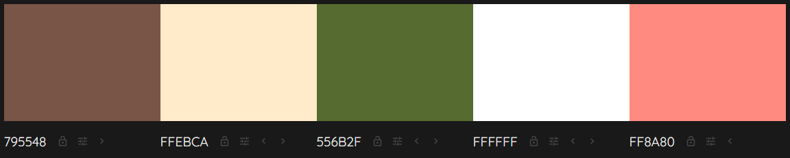
Holistic Healing Websites
Palette 1: Calm and Soothing
- Soft Green (#A8D5BA): Background for a natural and calming effect.
- Dark Green (#2E7D32): Headers and key text for grounding elements.
- Beige (#F5F5DC): Secondary background to maintain a serene feel.
- White (#FFFFFF): Main text for clarity and simplicity.
- Light Lavender (#E1BEE7): Call-to-action buttons for a gentle, inviting touch.
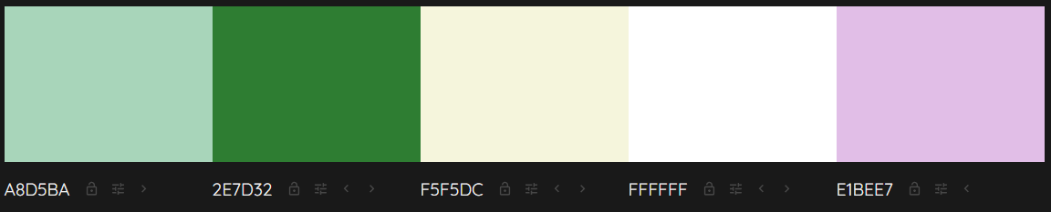
Palette 2: Earthy and Warm
- Warm Brown (#795548): Headers and primary accents for an earthy tone.
- Light Sand (#FFEBCA): Background for a soft, warm atmosphere.
- Dark Olive Green (#556B2F): Secondary text for a natural, holistic feel.
- White (#FFFFFF): Main text for readability.
- Soft Coral (#FF8A80): Call-to-action buttons to add a warm, welcoming vibe.
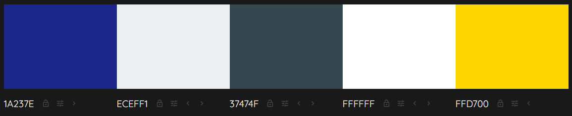
Real Estate Websites
Palette 1: Elegant and Trustworthy
- Navy Blue (#1A237E): Primary color for headers and accents to convey trust.
- Light Grey (#ECEFF1): Background for a clean, modern look.
- Dark Grey (#37474F): Secondary text and borders for sophistication.
- White (#FFFFFF): Main text for high contrast and readability.
- Gold (#FFD700): Call-to-action buttons for a touch of elegance and urgency.
Palette 2: Modern and Inviting
- Royal Blue (#1976D2): Headers and key highlights to convey trust and professionalism.
- Light Blue (#E3F2FD): Background for a welcoming and airy feel.
- Charcoal Grey (#263238): Text for high readability and a modern look.
- White (#FFFFFF): Secondary text and background highlights.
- Bright Red (#D32F2F): Call-to-action buttons for a striking, attention-grabbing effect.

Website Color Theory and Color Combinations
There are thousands of color combinations. When thinking about your website, remember the message you want to convey with color and the ability for people to read and understand your website using colors.
Some colors cause a “vibration” when they touch each other. The edges seem to wiggle. This is bad for website design and accessibility.
Some colors lack enough contrast and blend, making them hard to read and comprehend. These color combinations are also bad for website accessibility.
Summary
Understanding and leveraging the role of color psychology in website design can transform how users interact with your site. By selecting colors that evoke the right emotions and guide user behavior, you can create a more effective and engaging user experience. This approach can help turn casual visitors into loyal customers, ultimately boosting your business’s success.